If you are searching for the best warm neutral paint colours canada has to offer, start with one fact most design blogs ignore: Toronto’s natural light is fundamentally different from the sunbelt cities where most paint recommendations originate. Our northern latitude delivers a cooler daylight spectrum, our winters cut sunshine hours nearly in half, and thousands of north-facing condo units and deep Victorian floor plans push already-muted colours even cooler. Choosing the right warm neutral here is not just an aesthetic decision — it is a climate-and-architecture decision. This guide gives you the exact shades, specs, and testing methods that actually work in Toronto homes.
Why Best Warm Neutral Paint Colours Look Different in Canadian Light
Toronto receives roughly 2,066 sunshine hours per year — about 45 percent of total daylight hours . Compare that to Los Angeles at over 3,200 hours or Miami at nearly 3,000. That gap means a paint swatch that reads as a rich, honeyed beige in a south-facing Phoenix showroom can flatten into a dull, slightly pink grey on a January afternoon in a Leslieville semi.
The culprit is colour temperature. Toronto’s overcast skies push ambient light toward the 6,500–7,500 Kelvin range — noticeably blue-cool. Warm neutrals with yellow, amber, or terracotta undertones counteract that coolness, while neutrals leaning taupe or greige can tip into lifeless territory from November through March. If you have explored warm living room ideas for Canadian winters, you already know how much layering matters — and paint is the largest single layer in any room.
“In Toronto, I always push clients toward neutrals with a visible warm undertone — something you can actually name, like honey, clay, or wheat. If you cannot describe the warmth, it will disappear under our winter sky.” — Toronto Interior Designer editorial guidance
Your home’s era compounds the challenge. Over 60 percent of Toronto’s housing stock was built before 1980 , featuring smaller window openings and deeper floor plans than modern construction. These older layouts amplify cool shadows in hallways and interior rooms, making LRV (Light Reflectance Value) your most important paint spec — more on that below.
10 Best Warm Neutral Paint Colours Canada Designers Recommend (With LRV Ratings)
Compare the Retailers Mentioned Here
Use the same shortlist from the article and compare scale, finish options, and delivery fit before you buy.
Toronto Interior Designer may earn a commission if you shop through these links at no extra cost to you.
LRV measures how much light a colour reflects on a scale from 0 (pure black) to 100 (pure white). For Toronto’s main living spaces, designers recommend choosing neutrals in the LRV 50–70 range to compensate for reduced natural light. Below LRV 45, even a warm shade can feel heavy during a grey February; above LRV 75, the colour may wash out under direct summer sun.
Here are ten proven warm neutrals available at Canadian retailers, compared side by side:
| Paint Colour | Brand | LRV | Price Range (CAD) | Best For | Design Style |
|---|---|---|---|---|---|
| White Dove (OC-17) | Benjamin Moore | 85 | $75–$90 / gal | Trim, ceilings, bright base | Classic, transitional |
| Accessible Beige (SW 7036) | Sherwin-Williams | 58 | $70–$85 / gal | Open-concept living areas | Modern neutral |
| Pale Oak (OC-20) | Benjamin Moore | 70 | $75–$90 / gal | North-facing rooms, condos | Warm minimal |
| Jute (SW 6108) | Sherwin-Williams | 47 | $70–$85 / gal | Accent walls, dens | Earthy, cocooning |
| Oxford White (CC-30) | Benjamin Moore | 79 | $75–$90 / gal | Kitchens, bathrooms | Warm contemporary |
| Stony Ground (No. 211) | Farrow & Ball | 46 | $130–$155 / gal | Victorian feature rooms | Heritage, layered |
| Joa’s White (No. 226) | Farrow & Ball | 54 | $130–$155 / gal | Dining rooms, studies | Warm traditional |
| Natural Linen (CIL / Dulux) | Dulux | 62 | $55–$70 / gal | Budget-friendly whole-home | Casual, family |
| Nomadic Desert (SW 6107) | Sherwin-Williams | 38 | $70–$85 / gal | Statement walls, entries | Southwest modern |
| Clay Beige (OC-11) | Benjamin Moore | 60 | $75–$90 / gal | Versatile main rooms | Transitional, warm |
All ten are stocked or colour-matched at Canadian retailers. Benjamin Moore, Farrow & Ball, and Dulux are widely available through independent Toronto paint shops and Home Hardware. Sherwin-Williams operates over 30 locations across the Greater Toronto Area, making sampling easy.
Who Should Consider Warm Neutrals
- Condo owners with north- or east-facing units who find their current walls feel cold and flat
- Victorian and Edwardian homeowners dealing with narrow hallways and small window openings
- Anyone planning a renovation who wants a cohesive backdrop before choosing cabinetry, flooring, or tile — see our renovation tips for more guidance
- Families looking for forgiving, liveable colour that hides scuffs better than stark white
- Home sellers staging for the Toronto market, where warm neutrals consistently photograph well under mixed lighting
How to Test Warm Neutral Paint Colours in Toronto’s Light — Room by Room
Never choose a paint colour from a fan deck alone. In Toronto, you need to test under the specific light conditions of your actual space. Here is the Toronto Interior Designer method:
Step 1: Get large samples. Paint two coats on a 2 × 2 foot piece of white foam board — not directly on the wall. Move the board around the room over 48 hours to see how the colour shifts from morning to evening and under overcast versus sunny skies.
Step 2: Test the north wall. The north-facing wall receives the coolest, most diffused light in any Toronto room. If your warm neutral still reads warm there, it will work everywhere else. If it goes flat or grey, move one step warmer on the brand’s colour strip.
Step 3: Check under artificial light at night. Most Toronto homes rely on overhead pot lights or lamps from October through April. Warm-toned LED bulbs (2,700 K) will enhance your neutral; cool-white bulbs (4,000 K+) will fight it. Match your bulbs to your paint, not the other way around. Our guide to home office lighting layers for Canadian winters covers this in detail.
Step 4: Compare against fixed finishes. Hold the sample board next to your kitchen countertop, bathroom tile, or hardwood floor. Warm neutrals with yellow undertones pair well with oak and brass; those with pink or clay undertones complement walnut and matte black hardware.
Best Warm-Neutral Paint Pairings for Toronto’s Most Common Home Styles
With your testing method in hand, the next step is matching the right warm neutral to your home’s architecture. Toronto’s housing stock spans more than a century of building styles, and each one interacts with light differently.
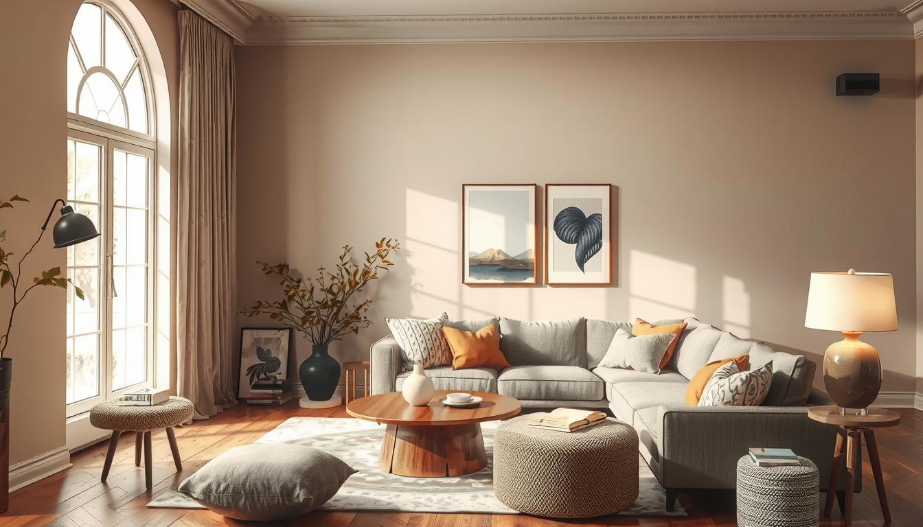
Downtown condos (post-2000 builds). These units typically feature floor-to-ceiling windows, exposed concrete ceilings, and grey-toned engineered flooring. The cool material palette demands a neutral with enough warmth to push back — Pale Oak or Accessible Beige at LRV 58–70 work well without feeling heavy in compact layouts. Pair either with warm brass light fixtures and a natural wood console to anchor the warmth.
Victorian and Edwardian row houses. Deep floor plans and tall, narrow windows create dramatic light gradients from front to back. Use a higher-LRV neutral like Clay Beige (LRV 60) in back kitchens and hallways, then drop to a richer shade like Jute (LRV 47) in the front parlour where more light enters. This two-tone strategy respects the home’s natural rhythm without leaving any room feeling dingy.
Post-war semis and bungalows. Moderate window sizes and standard eight-foot ceilings make these homes the easiest to colour. A single warm neutral in the LRV 55–65 range — Natural Linen from Dulux is an excellent budget pick at roughly half the cost of premium brands — can run through the entire main floor for a cohesive, open feel.
Edwardian three-storeys. Each floor gets progressively less light as you move up to smaller third-storey bedrooms. Increase warmth and LRV as ceiling heights shrink: start with Joa’s White (LRV 54) on the main floor, shift to Oxford White (LRV 79) on the third. The gradual lightening keeps upper rooms from feeling closed in during Toronto’s short winter days.
Where to Buy and What to Do Next
Every colour in this guide is available through Canadian retailers — no cross-border ordering required. Benjamin Moore dealers, Sherwin-Williams stores, Home Hardware, and select Farrow & Ball stockists across Toronto carry sample pots ranging from $10 to $18 CAD, a small investment that saves hundreds in repainting mistakes.
Finding the best warm neutral paint colours canada homes deserve comes down to respecting your specific light, your home’s architecture, and the long grey season that defines half our year. Start with two to three large samples, test them over a full weekend, and trust what your eyes tell you at 4 p.m. on a cloudy day — that is the light you will live with most.
Your Next Steps
- Pick two to three colours from the comparison table above that match your home style and LRV needs.
- Buy sample pots at your nearest Toronto paint retailer and paint foam-board swatches.
- Test for 48 hours across different walls, times of day, and lighting conditions.
- Photograph each swatch under overcast daylight and evening lamplight to compare side by side.
- Commit to one colour only after seeing it on the north-facing wall under grey-sky light.
- Book a colour consultation with a local designer if you are torn — most Toronto studios offer one-hour sessions for $150–$300 CAD.
Shop Elevated Alternatives
If you want a step up in materials or silhouette, compare mid-range brands before locking into the first affordable option.
Toronto Interior Designer may earn a commission if you shop through these links at no extra cost to you.
Sources
- Environment Canada climate normals — https://climate.weather.gc.ca
- City of Toronto housing data — https://www.toronto.ca/city-government/data-research-maps/
Frequently Asked Questions
What are the best warm neutral paint colours for Canadian homes with limited natural light?
For Canadian homes with limited light, choose warm neutrals in the LRV 50–70 range such as Pale Oak (LRV 70), Accessible Beige (LRV 58), or Natural Linen (LRV 62). These shades reflect enough light to keep rooms feeling open while their warm undertones counteract the cool, blue-toned daylight common in northern latitudes during winter months.
How do I test warm neutral paint colours in Toronto’s changing light?
Paint two coats on a 2×2 foot white foam board and move it around the room over 48 hours. Test on the north-facing wall first — if the colour still reads warm there, it will work everywhere. Check under both overcast daylight and evening artificial light with 2,700K warm LED bulbs for accurate results.
Are warm neutral paint colours good for resale value in Canada?
Yes. Warm neutrals consistently photograph well under mixed lighting and appeal to the widest range of buyers. Toronto staging professionals favour shades like Clay Beige, Accessible Beige, and Pale Oak because they create a welcoming backdrop that lets buyers envision their own furnishings in the space.