If you have searched for warm bedroom colours Canada homeowners can rely on through the darkest months, you have probably noticed something frustrating: the terracotta or golden ochre that looked perfect on a paint chip can turn muddy or flat once it hits your bedroom wall in January. The problem is not the colour itself — it is the light. Toronto gets roughly nine hours of daylight at the winter solstice compared to more than fifteen in June, and that low-angle winter sun casts a distinctly cool, blue-toned glow indoors. Most paint recommendations come from US or UK sources that never account for these conditions. This guide, developed from real Toronto Interior Designer project experience, shows you how to pick warm tones that hold up when it matters most.
Why Canadian Winter Light Makes Warm Bedroom Colours Fall Flat
Colour is not a fixed property of a surface — it is a product of pigment and light source combined. In northern-latitude cities like Toronto, winter sunlight enters at a steep angle and passes through more atmosphere, stripping warmth from its spectrum. North-facing bedrooms receive almost no direct sun year-round, relying instead on cool, diffused sky light that can make a warm beige read as dingy grey.
This is why a swatch that glowed amber under the hardware store’s fluorescent lights can disappoint at home. The pigment’s warm undertone needs enough warm-spectrum light to activate it. Without that light — which is exactly what Canadian winters withhold — warm colours lose their richness.
The fix is not to avoid warm tones. It is to choose colours with strong enough yellow, red, or orange undertones to push through cool ambient light, and then support them with the right artificial lighting and textiles.
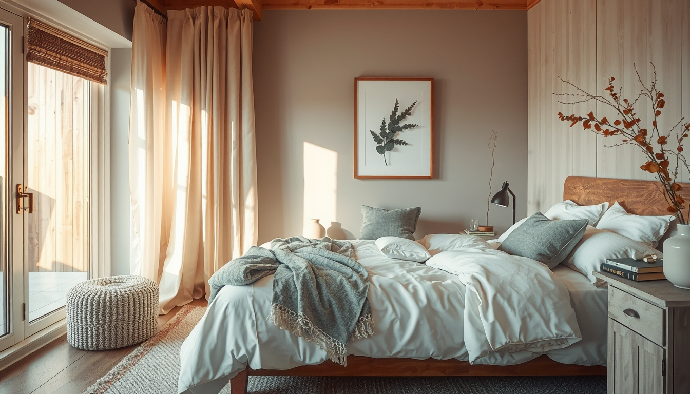
5 Warm Bedroom Colour Palettes for Low-Light Canadian Rooms
Build a Warm, Layered Bedroom
Prioritize bedding, bedside lighting, and storage pieces that make small bedrooms feel softer and more restful.
Toronto Interior Designer may earn a commission if you shop through these links at no extra cost to you.
Not every warm colour performs equally in limited daylight. Here are five palette families that Toronto designers return to season after season, chosen because their undertones hold warmth even under grey skies.
| Palette Name | Lead Wall Colour | Accent Tones | Best Room Orientation | Budget Range (CAD) for Paint |
|---|---|---|---|---|
| Golden Wheat | Soft ochre with yellow undertone | Cream, warm walnut, brass | North- or east-facing | $200–$400 |
| Terracotta Calm | Muted clay with red-orange base | Sand, dried sage, copper | South- or west-facing | $200–$400 |
| Warm Blush | Dusty rose with peach undertone | Warm grey, linen white, wood tones | Any orientation | $200–$400 |
| Spiced Caramel | Deep amber with brown base | Ivory, tobacco leather, matte black | South- or west-facing | $250–$450 |
| Toasted Linen | Warm greige with golden undertone | Oat, mushroom, brushed nickel | North-facing (safest neutral) | $200–$350 |
A standard Toronto bedroom repaint runs roughly $200–$500 CAD in materials — one of the highest-ROI updates you can make without a contractor . For more renovation guidance, start with realistic budgets before committing to a full room overhaul.
“The biggest mistake I see in Canadian bedrooms is choosing a colour that looks warm on paper but has a green or violet undertone hiding underneath. In our winter light, those undertones take over completely.” — Toronto-based colour consultant
Choosing Warm Undertones by Room Orientation: North, South, and West-Facing
Orientation is the single most important variable when selecting warm bedroom colours Canada designers consider non-negotiable. Understanding how light enters your specific room prevents costly repaints and ensures your chosen palette performs year-round. Here is how to approach each exposure:
- North-facing rooms receive cool, indirect light all day. Choose colours with dominant yellow or peach undertones — golden wheat, warm honey, or soft apricot. Avoid anything with even a hint of green or violet; it will read cold.
- South-facing rooms get the most direct sun, even in winter. You have the widest palette freedom here. Deeper warm tones like terracotta, burnt sienna, or spiced caramel will glow without washing out.
- East-facing rooms get warm morning light that shifts cool by afternoon. Mid-tone warm neutrals — think toasted linen or dusty rose — balance both lighting conditions throughout the day.
- West-facing rooms receive warm, golden light in the afternoon and evening. Rich amber and clay tones come alive here, but test them in morning light too, when the room will be cooler-toned.
- Rooms with minimal windows (common in Toronto condos) depend almost entirely on artificial light. Pair warm wall colours with 2700K to 3000K LED bulbs to replicate the warm-spectrum light the room lacks naturally.
Layering warm artificial light with warm wall colours can even raise perceived temperature comfort — a meaningful benefit during Canadian heating season when every degree of perceived warmth counts. For ideas on how warm tones extend into other living spaces, consistency across connected rooms prevents jarring transitions.
How Toronto Designers Layer Warm Colours With Textiles and Lighting
Paint sets the foundation, but a bedroom that truly feels warm in February requires layering. Toronto Interior Designer projects typically build warmth in three tiers:
Tier 1 — Walls and ceiling. Apply your chosen warm tone to walls. Consider carrying a lighter version of the same hue onto the ceiling — even a quarter-strength tint — to envelop the room rather than cutting the warmth off at the crown moulding. This overhead continuation makes a dramatic difference in rooms with eight-foot ceilings, where white ceilings can reflect cool light back down onto warm walls.
Tier 2 — Textiles. Swap cool-toned bedding for linen or flannel in complementary warm shades. A chunky knit throw in cream or camel adds both visual and physical warmth. Layered curtains in a warm neutral — such as an unbleached cotton or a soft caramel sheer — filter incoming cool light before it neutralizes your wall colour. Wool or jute area rugs reinforce the warm palette underfoot, which matters when bare floors reflect cool tones upward.
Tier 3 — Lighting. Replace any 4000K or 5000K “daylight” bulbs with 2700K warm-white LEDs. Add a bedside lamp with a linen or amber-toned shade to pool warm light where you spend the most time. Smart bulbs that shift colour temperature throughout the day can mimic natural warmth even on overcast afternoons.
This three-tier approach means you are not relying on paint alone to do the heavy lifting — and it means your bedroom feels cohesive rather than like a single bold wall surrounded by cold elements.
Budget-Friendly Ways to Test Warm Bedroom Colours Before You Commit
Committing to a full bedroom repaint based on a two-inch swatch is a gamble in any climate, but Canadian light conditions make testing especially important. Here is a practical checklist:
- Paint large sample boards (at least 60 cm × 60 cm) on white poster board and move them around the room at different times of day. Check them at 8 a.m., noon, and 8 p.m. under both natural and artificial light.
- Test on two walls — place samples on both the wall that receives the most light and the one that receives the least. The colour will read differently on each.
- Evaluate on a grey January day, not a sunny one. You are designing for the worst-case light scenario, which is the baseline for roughly five months of the year.
- Compare at least three undertone families side by side (e.g., yellow-based warm, red-based warm, orange-based warm) to see which one your room’s light flatters most.
- Check against your existing furniture and flooring. A warm wall next to cool-toned grey laminate can create an unpleasant clash. Bring fabric and finish samples into the room alongside paint chips.
Peel-and-stick paint samples from brands like Benjamin Moore and Sherwin-Williams make this process cleaner, and most Toronto paint retailers carry them for a few dollars each. Browse our bedroom inspiration archive for real examples of warm palettes in Canadian homes.
What to Do Next
- Identify your bedroom’s orientation using a compass app and note where light enters at midday versus evening.
- Pick two palette families from the table above that match your room’s exposure.
- Buy large peel-and-stick samples or paint poster-board swatches in your top three choices.
- Test for at least 48 hours across different lighting conditions, including overcast mornings and lamplight evenings.
- Layer in textiles and warm-temperature bulbs before deciding the paint is not warm enough — context changes everything.
- Consult a Toronto Interior Designer if your room has unusual light challenges, such as deep floor plans, north-facing walls with minimal window area, or open-concept layouts where warm and cool zones collide.
Getting warm bedroom colours Canada homeowners can trust through a long winter is less about picking the “right” trending shade and more about understanding the light you are working with. Start with your room, not a trend report — and let the colour follow the light.
Shop Bedroom Essentials Without Guesswork
Use Canadian-friendly retailers with straightforward sizing and finish options before committing to larger pieces.
Toronto Interior Designer may earn a commission if you shop through these links at no extra cost to you.
Sources
- Canadian Home Builders’ Association — https://www.chba.ca
Frequently Asked Questions
What are the best warm bedroom colours for Canadian winter light?
The best warm bedroom colours Canada homeowners can use in winter include soft ochre, muted terracotta, dusty rose with peach undertones, deep amber, and warm greige with golden undertones. These palettes hold their warmth even under the cool, low-angle light typical of Canadian winters.
Why do warm paint colours look different in winter?
Canadian winter sunlight enters at a steep angle and passes through more atmosphere, stripping warm tones from its spectrum. North-facing rooms rely on cool diffused sky light, which can make warm beige appear grey. Choosing colours with strong yellow, red, or orange undertones helps them push through cool ambient light.
How should I test warm paint colours before committing?
Paint large sample boards (at least 60 cm × 60 cm) and check them at different times of day under both natural and artificial light. Always evaluate on an overcast day, test on two walls with different light exposure, and compare at least three undertone families side by side.