
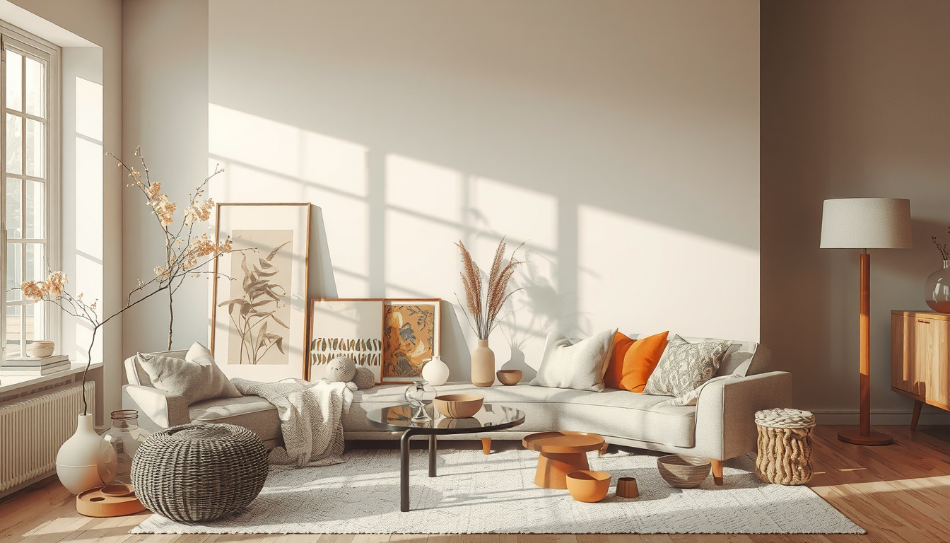
Feng shui colour by room works best with a three-part palette: one warm neutral base, one muted element-inspired secondary colour, and one concentrated accent. For Toronto homes, test each choice on two 60 × 60 cm movable boards before buying paint, because seasonal daylight and adjacent finishes can shift perceived undertones (Toronto Interior Designer editorial testing).
Meta description: Discover feng shui colour by room for Toronto homes, with five balanced palettes, local daylight advice, Canadian prices, and practical testing tips.
How Does Feng Shui Colour by Room Influence Energy?
Feng shui associates green with wood, red with fire, yellow and brown with earth, white and grey with metal, and black or deep blue with water (Bruun, 2008). These five phases describe changing relationships rather than rigid decorative categories (Encyclopaedia Britannica, “Wuxing”).
Colour is therefore best treated as one design layer—not as a guaranteed way to improve health, relationships, or wealth. Research indicates that emotional responses to colour vary with context, culture, saturation, brightness, and personal experience (Elliot and Maier, 2014).
A successful feng shui palette should make a room more comfortable and functional, not force every surface into a symbolic formula.
How should you build a balanced palette?
Begin with the room’s main activity, assess its daylight, and then use one of the five elements as an editing framework. Green can suggest growth without requiring every east-facing room to be green, while red can introduce warmth through one cushion or artwork rather than four walls (Bruun, 2008).
Our preferred formula uses approximately 60–70% base colour, 20–30% secondary colour, and no more than 10% concentrated accent as a flexible starting point rather than a strict feng shui rule (Toronto Interior Designer editorial guidance).
Five practical room palettes
| Room and goal | Recommended palette | Toronto application | Typical Canadian cost |
|---|---|---|---|
| Living room: connection | Warm white, olive, rust | Repeat accents through art, cushions, and planters | C$40–C$100 per cushion (EQ3 Canada) |
| Bedroom: rest | Soft blue-green, clay, warm white | Check undertones in cool winter daylight | C$10–C$15 per paint sample (Benjamin Moore Canada) |
| Kitchen and dining: activity | Warm white, ochre, natural wood | Choose washable coatings near cooking areas | C$80–C$130 per 3.79 L premium paint (Benjamin Moore Canada) |
| Bathroom: warmth | Mushroom, pale green, light wood | Avoid dark glossy finishes where spotting is a concern | C$25–C$60 per bath mat (IKEA Canada) |
| Home office: focus | Blue-green, warm grey, restrained yellow | Keep the video-call background quieter than the desk wall | C$60–C$150 per task lamp (IKEA Canada) |
Retail prices vary by finish, location, and promotion, so confirm current Canadian pricing before purchasing (Benjamin Moore Canada; EQ3 Canada; IKEA Canada).
Which Feng Shui Colours Work Best in Kitchens and Dining Rooms?
Find the Finishing Pieces
Accent lighting, ceramics, mirrors, and small furniture often make the biggest difference in builder-grade rooms.
Toronto Interior Designer may earn a commission if you shop through these links at no extra cost to you.
Warm white, olive, muted ochre, and natural wood create a practical kitchen palette. Traditional interpretations already associate cooking with fire, while kitchens also contain visible metal and water elements; extensive saturated red can therefore feel unnecessarily intense (Bruun, 2008).
Use warm white across the largest surfaces, olive on cabinetry or textiles, and ochre through dining upholstery or ceramics. A mocha island can visually ground an open kitchen connected to a living room (Toronto Interior Designer editorial guidance).
How should permanent kitchen finishes be coordinated?
Compare cabinet, counter, backsplash, flooring, and wall samples together before ordering. We have tested finish combinations under both window light and evening bulbs and found that materials selected separately can reveal conflicting pink, yellow, or grey undertones when assembled (Toronto Interior Designer editorial testing).
Before choosing counters, compare appearance and maintenance requirements in our guide to natural stone countertop options. More planning ideas are available in the kitchen and dining design archive.
How does Toronto housing affect a kitchen palette?
A CityPlace condo kitchen may receive borrowed daylight from the living area, while a Junction semi-detached house may have separate east- and west-facing exposures. Towers, balconies, mature trees, and deep window reveals can reduce or redirect the available daylight, so the actual room should be tested rather than judged from its compass direction alone (National Research Council Canada).
Toronto condo owners should review their corporation’s declaration, bylaws, and rules before replacing flooring, tile, plumbing, or other permanent finishes. Condominium corporations can require renovation applications, deposits, approved work hours, and contractor documentation (Condominium Authority of Ontario; Ontario Condominium Act, 1998).
Which Feng Shui Colours Work Best in Bathrooms?
Mushroom, warm white, muted green, and pale wood tones can soften a bathroom’s hard, reflective surfaces. Deep blue or black works more practically as a controlled accent on a vanity, mirror frame, towel, or artwork than as a finish across every surface (Toronto Interior Designer editorial guidance).
Toronto’s treated water averaged approximately 117 mg/L as calcium carbonate in 2023, placing it in the moderately hard range (City of Toronto, 2023 Drinking Water Analysis Summary). Mineral spotting is generally more visible on glossy black faucets and dark tile, so maintenance should take priority over colour symbolism.
Which bathroom changes require approval?
Repainting alone normally does not require a Toronto building permit, but relocating plumbing, changing structural components, or altering certain fire-safety systems can require municipal permits and inspections (City of Toronto, “When Is a Building Permit Required?”).
Condo rules may also apply even when a City permit is unnecessary, particularly where work affects common elements, waterproofing, plumbing, or contractor access (Condominium Authority of Ontario). Review our Toronto bathroom design guidance before committing to permanent dark fixtures or tile.
Which Feng Shui Living Room Colours Encourage Connection?
A living room benefits from a calm base and one expressive social colour. Warm white, vanilla, mushroom, or light mocha can form the background; green represents wood and growth, while restrained peach, red, or terracotta accents introduce fire symbolism (Bruun, 2008).
In a compact Toronto condo, distribute colour through several small elements instead of concentrating every strong hue on one feature wall. Repeating olive in a cushion, artwork, and planter creates visual rhythm, while a small rust accent can draw attention toward the seating area (Toronto Interior Designer editorial guidance).
How much does paint reflectance matter?
Light reflectance value, or LRV, indicates the percentage of visible light a paint colour reflects (Benjamin Moore). Benjamin Moore lists White Dove OC-17 at 83.16 LRV, October Mist 1495 at 46.54, and Hale Navy HC-154 at 8.36 LRV (Benjamin Moore colour specifications).
Lower-LRV colours absorb more visible light and generally require more deliberate placement in rooms with limited daylight (Benjamin Moore). A low-LRV navy may suit one controlled wall in a CityPlace condo but cover a larger area successfully in a wider Junction dining room with multiple exposures (Toronto Interior Designer editorial guidance).
How should colour work in a multipurpose condo room?
Assign colour according to activity rather than architectural boundaries. A blue-green desk wall can identify the work zone, while vanilla or soft mocha creates a warmer seating area after sunset; repeating one undertone helps connect both zones (Toronto Interior Designer editorial guidance).
For another way to connect seating areas, consult our relationship corner feng shui guide. Renters can create similar zoning with curtains, removable artwork, cushions, and rugs, avoiding permanent changes that may require landlord approval (Residential Tenancies Act, 2006).
Which Feng Shui Bedroom Colours Support Calm and Intimacy?
Soft blue, muted green, warm white, clay, and softened brown create lower visual contrast than vivid red or orange. No single hue is universally calming because colour responses depend on brightness, saturation, context, culture, and learned associations (Elliot and Maier, 2014).
If red feels energizing, limit it to a rust cushion, peach throw, or burgundy artwork. For a shared bedroom, select colours both occupants genuinely like and use a balanced pair of bedside elements to reinforce visual symmetry (Toronto Interior Designer editorial guidance).
Can bedroom colour improve sleep?
Colour can support a restful atmosphere, but it cannot correct sleep disruption caused by traffic, streetcars, delivery vehicles, or mechanical systems. Acoustic conditions and personal colour responses remain separate design considerations (Elliot and Maier, 2014).
Toronto residents dealing with exterior noise can combine a low-contrast palette with the practical measures in our guide to creating a quiet bedroom from street noise. Bedding, curtains, and other lower-commitment layers can be explored in the bedroom design archive.
How should bedroom paint be tested?
Paint at least two movable boards measuring approximately 60 × 60 cm, then inspect them beside the bed, window, flooring, and textiles. This size is our practical testing recommendation rather than a building or industry standard (Toronto Interior Designer editorial testing).
In our editorial testing protocol, we assess each board in morning daylight, after sunset, and under the room’s actual bedside bulbs. We keep samples in place for at least two typical days because a green may appear greyer beside cool flooring and warmer beside oak (Toronto Interior Designer editorial testing).
How Should Toronto Light Affect Feng Shui Colour by Room?
Toronto sits at approximately 43.7° north and experiences substantial seasonal changes in daylight duration (Natural Resources Canada; National Research Council Canada). The same beige can therefore appear clearer in summer, duller in winter, or pinker under warm evening bulbs, depending on the paint formulation and surrounding finishes (National Research Council Canada; Toronto Interior Designer editorial testing).
North-facing rooms generally receive cooler indirect light, while west-facing rooms often become warmer later in the day (National Research Council Canada). These are daylight-orientation effects—not feng shui rules—and nearby buildings, trees, balconies, and window depth can materially change the result (National Research Council Canada).
What is the safest palette for limited daylight?
Choose a warm off-white base, one muted nature-led secondary colour, and one concentrated accent. Olive or blue-green is a versatile secondary choice for a low-light Toronto home; peach, ochre, or rust can warm a room that feels cold, while chocolate or deep blue is easier to manage where daylight and pale furnishings provide contrast (Toronto Interior Designer editorial guidance).
Always compare the manufacturer’s LRV and test large samples before buying several containers. A paint chip is too small to show how colour will interact with flooring, cabinetry, upholstery, and changing daylight across an entire room (Benjamin Moore; Toronto Interior Designer editorial testing).
What Is the Best Feng Shui Colour by Room Checklist?
Use symbolism only after accounting for room function, existing finishes, maintenance, and the occupants’ preferences. The strongest palette is one that remains comfortable in Toronto’s changing daylight and works with the home’s actual materials (Toronto Interior Designer editorial guidance).
- Identify the room’s main activity before choosing an element association.
- Select one base, one secondary colour, and one smaller accent.
- Check the paint manufacturer’s published LRV.
- Test two approximately 60 × 60 cm movable samples.
- Inspect samples in morning, evening, and artificial light.
- Compare paint beside flooring, counters, cabinetry, and upholstery.
- Use removable textiles and artwork when renting.
- Review condo rules before changing flooring, tile, or plumbing.
- Confirm current Canadian prices and product availability.
- Explore more living-space colour and layout ideas and decor and accent guidance.
Sources
- Benjamin Moore Canada. Colour specifications for White Dove OC-17, October Mist 1495, and Hale Navy HC-154; Canadian paint and sample listings.
- Bruun, Ole. An Introduction to Feng Shui. Cambridge University Press, 2008.
- City of Toronto. 2023 Drinking Water Analysis Summary.
- City of Toronto. “When Is a Building Permit Required?”
- Condominium Authority of Ontario. Renovation, governing-document, and condominium-rule guidance.
- Elliot, Andrew J., and Markus A. Maier. “Color Psychology: Effects of Perceiving Color on Psychological Functioning in Humans.” Annual Review of Psychology, 2014.
- Encyclopaedia Britannica. “Wuxing.”
- EQ3 Canada. Canadian furniture, textile, and accessory listings.
- IKEA Canada. Canadian bathroom textile and lighting listings.
- National Research Council Canada. Daylighting Guide for Canadian Commercial Buildings.
- Natural Resources Canada. Canadian geographical and solar-data resources.
- Ontario. Condominium Act, 1998 and Residential Tenancies Act, 2006.
Frequently Asked Questions
What is the best feng shui colour for a living room?
Warm off-white with muted green is the most flexible living-room combination because it pairs a reflective neutral with the traditional wood element (Bruun, 2008). Keep a stronger peach, rust, or red accent to approximately 10% of the palette as a practical starting point (Toronto Interior Designer editorial guidance).
What feng shui colours are best for a bedroom?
Soft blue, muted green, clay, and warm off-white are practical choices because they create less contrast than vivid red or orange. Test at least two 60 × 60 cm boards under daylight and bedside lighting because colour response changes with context and illumination (Elliot and Maier, 2014; Toronto Interior Designer editorial testing).
Should a kitchen be red in feng shui?
No, a kitchen does not need to be red because traditional feng shui already associates cooking with the fire element (Bruun, 2008). Limit red to one or two small accents, then balance it with warm white, olive, ochre, or natural wood (Toronto Interior Designer editorial guidance).
Which bathroom colour is easiest to maintain in Toronto?
Warm white, mushroom, or pale green is generally easier to maintain visually than glossy black where mineral spotting is a concern. Toronto reported average treated-water hardness of approximately 117 mg/L as calcium carbonate in 2023 (City of Toronto).
Do I need a Toronto permit to repaint a condo?
No, repainting alone normally requires zero City of Toronto building permits (City of Toronto). Your condo corporation may still regulate contractor access and work hours, while plumbing, structural, or fire-safety alterations can require municipal and condominium approvals (Condominium Authority of Ontario).
How large should a paint sample be?
Use a sample approximately 60 × 60 cm so the colour can be assessed beside flooring, furniture, and window light (Toronto Interior Designer editorial testing). Move at least two boards around the room and inspect them at three points—morning, evening, and under artificial light—before purchasing full-size paint containers.
Toronto Interior Designer Editorial Team | Toronto Design Editors The Toronto Interior Designer Editorial Team produces practical, evidence-led decorating guidance for homeowners, condo residents, and renters across the GTA. Its coverage focuses on Toronto light conditions, local housing constraints, Canadian products, and room-by-room design decisions. (/author/editorial-team/)
Source Warm, Livable Staples
Natural textures and simple silhouettes are easier to layer when you start with timeless foundational pieces.
Toronto Interior Designer may earn a commission if you shop through these links at no extra cost to you.
Frequently Asked Questions
What is the best feng shui colour for a living room?
Warm off-white with muted green creates a flexible, balanced living room palette. Add peach, rust, or red on one focal surface for controlled fire energy.
What feng shui colours are best for a bedroom?
Soft blue, muted green, clay, and warm off-white support a calm, low-contrast bedroom. Test at least 2 large samples in daylight and under bedside lighting.
Should a kitchen be red in feng shui?
No, a kitchen does not need to be red because cooking already represents fire energy. Limit red to 1 or 2 accents and balance it with warm white, olive, ochre, or wood.
Toronto Interior Designer is editorially independent. Our recommendations are based on research and editorial judgment, not brand sponsorships.