If you search neutral home decor ideas Canada online, almost every result is written for homes bathed in California sun or soft London grey. That advice can steer you wrong. Toronto gets roughly 2,066 sunshine hours per year compared to over 3,000 in Los Angeles, and our winter light arrives at sharp, low angles that push cool whites toward icy blue . A neutral palette that looks warm on a Pinterest board can feel flat and cold in a north-facing Leslieville condo by November. This guide is built for Canadian conditions — our light, our materials, our compact layouts — so your neutrals stay warm twelve months a year.
Why Neutral Home Decor Looks Different Under Canadian Light
The neutral trend sweeping design media in 2026 — raw plaster, limewash walls, tonal layering — originated in sun-drenched studios and showrooms. Architectural Digest’s recent observation that “everything looks like WSA” confirms the aesthetic has gone mainstream . But mainstream advice ignores a basic physics problem: light quality changes everything about how a paint colour reads on a wall.
In Toronto, north-facing rooms receive almost no direct sunlight from October through March. Blue-grey overcast skies become the dominant light source, and snow reflection amplifies cool tones further. A warm white that reads as creamy in Austin will lean grey or even lavender here. That is why undertone selection matters more in Canada than in any US market.
The practical fix is Light Reflectance Value (LRV). For north-facing Canadian rooms, choose paints with an LRV above 65 to counteract low winter light. South-facing rooms can handle deeper taupes and greiges in the 45–60 range without feeling dim. Every paint swatch should be tested on the actual wall, observed at 10 a.m., 2 p.m., and under evening light before committing — a step Toronto Interior Designer recommends for every project.
5 Essential Neutral Tones Every Canadian Home Needs in 2026
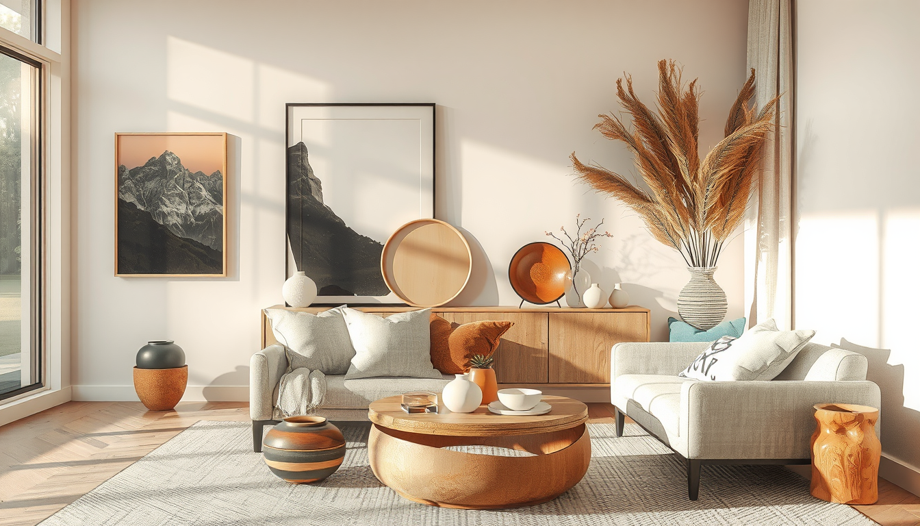
Find the Finishing Pieces
Accent lighting, ceramics, mirrors, and small furniture often make the biggest difference in builder-grade rooms.
Toronto Interior Designer may earn a commission if you shop through these links at no extra cost to you.
Forget the single “perfect greige.” A functional Canadian neutral palette needs at least five tones working together. Benjamin Moore’s 2026 Colour of the Year, Cinnamon Slate, signals the industry’s pivot toward heritage warmth, and Behr’s 2026 picks follow the same earthy direction . House & Home’s 2026 paint colour report confirms warm, grounded tones are dominating Canadian interiors .
Here are the five roles to fill:
- Bright Warm White (LRV 78–85) — Your ceiling and trim colour. Look for yellow or pink undertones, never blue. Try Benjamin Moore Simply White or Farrow & Ball Warm White.
- Soft Cream (LRV 68–75) — The workhorse wall colour for north-facing rooms. Dulux Gentle Cream or BM Navajo White are reliable in Toronto light.
- Mid-Tone Greige (LRV 50–62) — Use on accent walls, cabinetry, or built-ins. BM Revere Pewter remains a Canadian favourite for good reason.
- Warm Taupe (LRV 35–48) — Grounds furniture, textiles, and millwork. Pulls a room together without introducing colour.
- Deep Warm Brown (LRV 10–20) — Your anchor. Use sparingly on a console, shelf, or floor stain to give the palette depth.
“A neutral room without depth is just a beige room. The magic happens when five tones create a quiet conversation across surfaces — that’s what makes a space feel calm instead of blank.”
How to Layer Textures in a Neutral Canadian Interior
Colour restraint only works when texture does the heavy lifting. This is where the 2026 material-honesty movement — raw wood, handwrought metal, clay, stone — earns its place in Canadian homes . If you appreciate the wabi-sabi approach to natural materials, neutral layering is its close cousin.
Canadian-sourced materials give you an edge no imported catalogue can match:
| Material | Source | Best Use | Budget Range (CAD) |
|---|---|---|---|
| Ontario limestone | Regional quarries (Owen Sound, Wiarton) | Fireplace surrounds, bathroom tile | $18–$35/sq ft installed |
| Quebec white oak | Eastern Canadian mills | Wide-plank flooring, open shelving | $9–$16/sq ft unfinished |
| BC western red cedar | West coast mills | Accent walls, closet lining | $6–$12/sq ft |
| Canadian wool textiles | Local makers (e.g., MacAusland’s, PEI) | Throws, upholstery, rugs | $80–$350 per piece |
| Handmade ceramic tile | Ontario studios (e.g., Mercury Mosaics partners) | Kitchen backsplash, bathroom accents | $25–$50/sq ft installed |
The layering formula for a neutral Canadian room: one rough texture (raw plaster, stone, unfinished wood), one soft texture (wool, linen, bouclé), and one smooth surface (polished concrete, lacquered millwork, matte ceramic). Three texture types prevent monotony while keeping the palette cohesive.
Neutral Home Decor Ideas for Canadian Condos Room by Room
The average Toronto condo sits around 650 to 700 square feet, making a unified neutral palette a practical necessity for visual flow — not just an aesthetic preference . With that constraint in mind, here is how to adapt the approach room by room.
Living Room. Start with your mid-tone greige on walls and layer through furniture and textiles. A bouclé sofa in warm cream, a white-oak coffee table, and a wool area rug in oatmeal create three distinct texture layers in one seating area. For more living space inspiration, focus on pieces that serve double duty in compact layouts.
Kitchen. Neutral kitchens thrive on contrast between upper and lower cabinetry. Consider warm white uppers with taupe or greige lowers, paired with an Ontario limestone or honed quartz countertop. Open shelving in white oak adds material warmth without visual weight.
Bedroom. This is where layering matters most. Linen bedding, a chunky-knit throw, and blackout curtains in a deep warm tone create the cocoon effect Canadian winters demand. A cozy reading nook in the same neutral palette extends the room’s function without clashing.
Bathroom. Go bold with texture, not colour. Large-format matte porcelain in warm white on walls, smaller handmade tile on the floor, and natural stone on the vanity top give a small bathroom three visual layers that feel spa-like rather than sterile.
Best Canadian Brands for Neutral Home Decor
Supporting Canadian retailers means no cross-border duty surprises and pieces scaled for our spaces. Toronto Interior Designer has worked with many of these brands and can vouch for their quality in real Canadian homes:
- EQ3 (Winnipeg) — Clean-lined sofas and dining furniture in neutral upholstery. Showrooms in Toronto and Vancouver.
- Mjölk (Toronto) — Curated Japanese and Scandinavian ceramics, lighting, and objects. Perfect for finishing a neutral room with intentional accents.
- Casalife (Toronto) — Accessible modern furniture with a strong neutral range. Good value for condo-scale pieces.
- Wilder (Vancouver) — Handmade ceramics and home goods with a west-coast material sensibility.
- Article (Vancouver) — Online-first furniture with fast Canadian shipping and a deep selection of warm-toned upholstery.
Google Trends data shows that searches for “neutral home decor” in Canada have climbed roughly 40 percent from 2024 to 2026, peaking each January and September — the post-holiday reset and fall nesting seasons . The demand is real, and Canadian retailers are responding with stronger options every season.
What to Do Next
The best neutral home decor ideas Canada homeowners can act on right now are grounded in our specific light, materials, and space constraints — not imported from a sunnier climate. Here is your action checklist:
- Test before you commit. Paint three swatches of your top neutral picks and observe them at different times of day, especially on north-facing walls.
- Check the LRV. Any wall colour in a north-facing room should sit above 65 on the Light Reflectance Value scale.
- Build a five-tone palette. Map your bright white, soft cream, greige, taupe, and deep brown before buying a single can of paint.
- Layer three textures per room. One rough, one soft, one smooth — this is the formula that keeps neutral spaces from feeling flat.
- Shop Canadian first. EQ3, Mjölk, Casalife, and Article all offer pieces designed and scaled for how we live here.
- Revisit seasonally. Swap lighter linen throws for heavier wool in October; reverse it in April. Neutral palettes reward seasonal layering more than any other style.
Toronto Interior Designer publishes new guides on Canadian interiors every week — bookmark us and build your neutral palette with confidence.
Source Warm, Livable Staples
Natural textures and simple silhouettes are easier to layer when you start with timeless foundational pieces.
Toronto Interior Designer may earn a commission if you shop through these links at no extra cost to you.
Sources
- Environment Canada climate normals — https://climate.weather.gc.ca/
- Architectural Digest — https://www.architecturaldigest.com/
- Benjamin Moore — https://www.benjaminmoore.com/
- House & Home — https://houseandhome.com/
- Design Milk — https://design-milk.com/
- CMHC housing data — https://www.cmhc-schl.gc.ca/
- Google Trends — https://trends.google.com/
Frequently Asked Questions
What are the best neutral paint colours for Canadian homes?
Choose warm-undertone paints with a Light Reflectance Value above 65 for north-facing rooms, such as Benjamin Moore Simply White or Navajo White. South-facing rooms can handle deeper taupes and greiges in the 45–60 LRV range without feeling dim during Canadian winters.
How do I keep neutral decor from looking flat in winter?
Layer at least three texture types per room: one rough surface like raw plaster or stone, one soft material like wool or linen, and one smooth finish like polished concrete or lacquered millwork. This creates visual depth and warmth without adding colour.
Where can I buy neutral home decor in Canada?
Top Canadian retailers include EQ3, Mjölk, Casalife, Article, and Wilder. These brands offer pieces scaled for Canadian spaces with no cross-border duty surprises and ship quickly within Canada.