Most white walls living room ideas Canada homeowners find online ignore the single biggest factor shaping how those rooms actually feel: our light. Toronto sits at the 43rd parallel, which means winter sun enters south-facing windows at a low, sharp angle and barely reaches north-facing rooms at all. That dramatic seasonal swing — from golden summer floods to flat grey winter wash — makes white walls behave differently here than in Austin or Lisbon. The good news: once you understand how Canadian light interacts with white paint and furnishings, you can build a living room that feels bright and spacious year-round without ever reading as cold or sterile. Here is exactly how Toronto designers do it.
Why White Walls Look Different in Canadian Light (And How to Fix It)
White is never just white. Every white paint carries an undertone — blue, yellow, pink, green — and Toronto’s light conditions amplify those undertones more aggressively than in sunnier climates. The city receives roughly 2,066 hours of sunshine per year, but much of that falls in summer. During the five grey months from November through March, north-facing rooms lose almost all direct light, and a cool-toned white like Benjamin Moore Chantilly Lace (OC-65) can shift to an icy blue-grey that makes a room feel clinical.
The fix is simple: match your white to your exposure.
| Room Exposure | Recommended White | Undertone | Why It Works |
|---|---|---|---|
| South-facing | Chantilly Lace (OC-65) | Neutral-cool | Ample sun keeps it crisp without going cold |
| North-facing | White Dove (OC-17) | Warm yellow | Counteracts grey-sky blue cast |
| East-facing | Simply White (OC-117) | Soft warm | Handles bright morning / dim afternoon shifts |
| West-facing | Cloud White (OC-130) | Creamy neutral | Balances intense late-day orange sun |
Benjamin Moore’s Simply White and Chantilly Lace remain the two most-specified whites among GTA designers, but warm whites like White Dove are increasingly popular for north-facing condos and townhomes . Before committing, paint two large swatches on opposite walls and observe them at 10 a.m., 3 p.m., and under evening lighting. What looks perfect at noon may feel dingy by dinner.
5 Proven Layering Techniques to Warm Up White Walls
Source Scaled-Right Living Room Pieces
Start with apartment-scale sofas, nesting tables, and layered lighting that fit Toronto floor plans without overwhelming them.
Toronto Interior Designer may earn a commission if you shop through these links at no extra cost to you.
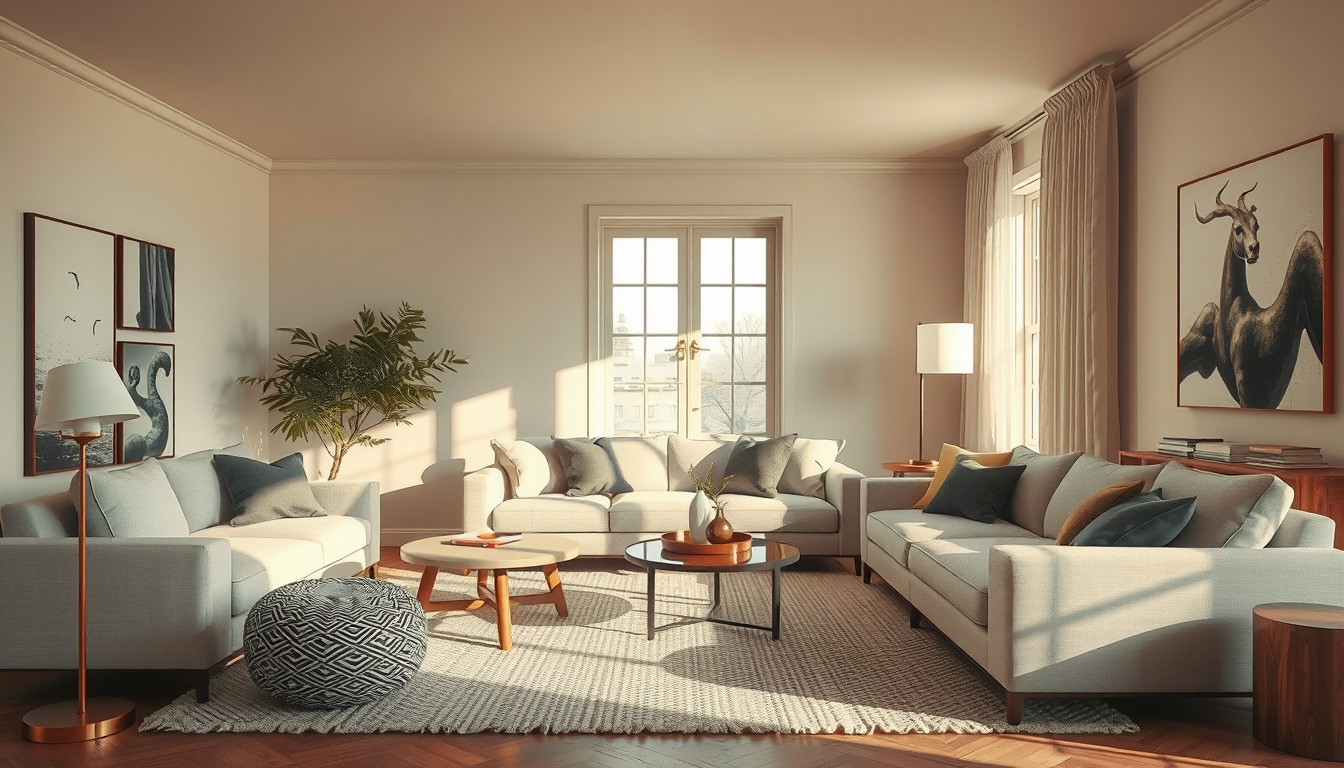
A white room needs texture the way a good soup needs salt — without it, everything falls flat. The 2026 design narrative centres on layered warmth against neutral backdrops, and Toronto Interior Designer contributors consistently recommend these five techniques:
- Start with warm wood tones. Walnut side tables, oak floating shelves, or a reclaimed-wood media console immediately ground a white room. If your floors are already a light engineered hardwood, add wood through furniture rather than fighting your flooring.
- Layer textiles in varying weights. A linen sofa, a chunky wool throw, and a flat-weave jute rug create depth through contrast. Avoid matching everything to the same fabric weight — the variety is what reads as “collected” rather than “staged.”
- Introduce one or two vintage or handcrafted objects. A hand-thrown ceramic vase, a vintage brass lamp, or an antique mirror breaks the uniformity that makes white rooms feel like a showroom. Domino’s 2026 coverage of “The Layered Home” confirms this lived-in approach is the dominant styling direction .
- Use matte and satin finishes together. White walls in eggshell, a matte-black light fixture, and a satin-brass door handle give the eye different surfaces to land on. Flat white paint absorbs light and feels softer than semi-gloss, which can create glare in south-facing rooms.
- Add one statement plant. A fiddle-leaf fig, a large snake plant, or a trailing pothos on a high shelf brings organic shape and colour that no amount of cushion-shopping can replicate.
“The rooms that feel best aren’t decorated — they’re layered. You should be able to point to something and say that has a story.” — a principle Toronto designers return to every season.
Best 2026 Accent Colours for White Walls Living Rooms in Canada
White walls are the ultimate canvas, but choosing what goes on that canvas matters. The 2026 palette leans warm and grounded, pulling from 1970s-inspired earth tones refreshed with cleaner lines . Here are the accent pairings Toronto Interior Designer editors are seeing in the strongest projects this year:
- Walnut brown + ochre gold. The most versatile pairing for white rooms. Works in mid-century and contemporary spaces alike.
- Slate blue + warm cream. Adds calm without coldness. Ideal for north-facing rooms where you want colour but cannot afford to drop the temperature further.
- Terracotta + olive green. A bolder move that suits south- or west-facing rooms with strong natural light. Bring these in through cushions, a single accent chair, or art.
- Charcoal + natural linen. For those who want contrast without colour. This combination keeps a white room feeling sophisticated and gender-neutral.
Avoid pure black accents in small spaces — they create hard visual stops that chop up a room. Charcoal or deep brown achieves the same contrast with a softer edge. For more living room inspiration, consider how your accent palette shifts between summer and winter — swapping a bright cushion cover for a deeper wool one takes five minutes and adjusts the room’s warmth instantly.
White Walls in Small Toronto Condos: Space-Saving Strategies That Work
The average Toronto condo hovers around 660 to 700 square feet, and roughly 68 percent of newer builds feature floor-to-ceiling windows . That glass is a gift for light but a liability in winter, when it amplifies cool tones and radiates cold. Here is how to handle it:
- Use warm white on every wall, including the ceiling. In a small condo, switching whites between walls creates visual chop. One consistent warm white unifies the space and makes it read larger.
- Float furniture away from walls. Even six inches of breathing room behind a sofa prevents the “pushed against the wall” look that makes small white rooms feel like dorm rooms.
- Hang curtains wide and high. Mount rods four inches above the frame and extend them eight inches past each side. The extra fabric softens all that glass and adds a textile layer to an otherwise hard-surfaced room.
- Choose a large area rug, not a small one. A rug that is too small makes a room feel smaller. In a 12-by-14-foot living area, aim for at least an 8-by-10 rug.
- Limit your palette to three materials. In compact spaces, restraint reads as intention. Pick one wood tone, one metal finish, and one textile family, then repeat them throughout the room.
If your condo feels especially stark in January, a quality space heater with a clean design can double as both a functional and visual warmth source during the coldest months.
Where to Source White-Room Decor in Toronto
Supporting Canadian makers solves two problems at once: you get unique, well-crafted pieces that add character, and you avoid the cookie-cutter look of importing the same mass-market decor everyone else has. Studios like Mjölk on Junction carry handcrafted ceramics and Scandinavian-Japanese furniture that pair beautifully with white walls. For textiles, look at Canadian brands producing linen throws, wool cushions, and hand-loomed rugs in warm, tonal palettes. Queen West, Ossington, and the Distillery District remain the best corridors for one-of-a-kind vintage finds — a single well-chosen piece does more for a white room than an entire set of matching accessories.
What to Do Next
- Test your white. Buy sample pots of two warm and two cool whites. Paint large swatches and live with them for 48 hours across all lighting conditions.
- Audit your textures. Walk through your living room and count distinct materials. If you hit fewer than four, add a textile or wood element.
- Pick one accent palette. Choose two or three colours from the 2026 pairings above and commit — scattered colour reads as clutter in a white room.
- Shop local first. Visit at least one Toronto showroom or vintage corridor before ordering online. The right piece often finds you in person.
- Swap seasonally. Budget for two sets of throw cushions and a winter-weight blanket. Five minutes of swapping keeps a white room feeling intentional all year.
White walls living room ideas Canada homeowners can actually use come down to understanding light, layering with purpose, and choosing pieces that earn their place. Get the undertone right, add warmth through texture rather than paint, and your white living room will feel like the calm, bright retreat it was meant to be — even in February.
Finish the Room With Texture
Layer in rugs, side tables, and decor accents that warm up condo living rooms without adding clutter.
Toronto Interior Designer may earn a commission if you shop through these links at no extra cost to you.
Sources
- House & Home 2026 decorating trends — https://houseandhome.com
- Domino — https://domino.com
- Homes & Gardens accent colour coverage — https://homesandgardens.com
- Urbanation condo market data — https://urbanation.ca
Frequently Asked Questions
What is the best white paint for north-facing living rooms in Canada?
Benjamin Moore White Dove (OC-17) is ideal for north-facing rooms in Canada. Its warm yellow undertone counteracts the blue-grey cast that grey skies create, keeping the space feeling soft and inviting rather than cold or clinical.
How do you make a white living room feel warm in a Toronto condo?
Layer warm wood tones, textured textiles like wool throws and jute rugs, and matte finishes throughout the space. Use one consistent warm white on all walls and ceiling, float furniture away from walls, and swap cushion covers seasonally for instant warmth adjustment.
What accent colours work best with white walls in 2026?
The strongest 2026 pairings include walnut brown with ochre gold, slate blue with warm cream, terracotta with olive green, and charcoal with natural linen. Choose two or three colours and commit to avoid a scattered look.