Most bedroom colour ideas Canada homeowners search for focus on what looks good — not what works. But the paint on your bedroom walls does more than set a mood. It directly affects how quickly you fall asleep, how long you stay asleep, and how rested you feel in the morning. A UK study of 2,000 households found that people sleeping in blue bedrooms averaged nearly 8 hours of rest per night, while those in purple rooms clocked under 6 . The catch? Those findings assume consistent light conditions year-round, which is not how Canadian homes work. Toronto gets over 15 hours of daylight in June and barely 9 in December, and that seasonal swing changes how every colour behaves on your walls.
Here at Toronto Interior Designer, we believe the right bedroom colour is the one that accounts for how you actually live — your light, your layout, and your latitude.
Why Bedroom Colour Ideas Affect Your Sleep More Than You Think
Colour psychology is not just marketing. Cool-toned hues — soft blues, muted greens, and dusty lavenders — are associated with lower heart rate and reduced blood pressure, both of which support the body’s natural sleep-onset process . Your brain reads wall colour as an environmental signal. A warm, saturated red triggers alertness. A desaturated sage tells your nervous system to wind down.
This matters more in bedrooms than in any other room because you spend extended time in low-light conditions there. When artificial light takes over in the evening, high-chroma colours can feel agitating rather than cozy. The 2026 trend toward “analog bedrooms” — tech-free, low-stimulation spaces designed for stillness — reinforces this shift . Designers are choosing colour for regulation, not decoration.
If you are working with a compact layout, colour becomes even more critical. A dark, poorly chosen hue can make a 10-by-11-foot condo bedroom feel claustrophobic, while the right muted tone opens it up visually and creates the illusion of depth. For layout strategies that pair well with smart colour choices, see our guide to small bedroom ideas for Canadian condos.
7 Best Bedroom Paint Colours for Canadian Homes in 2026
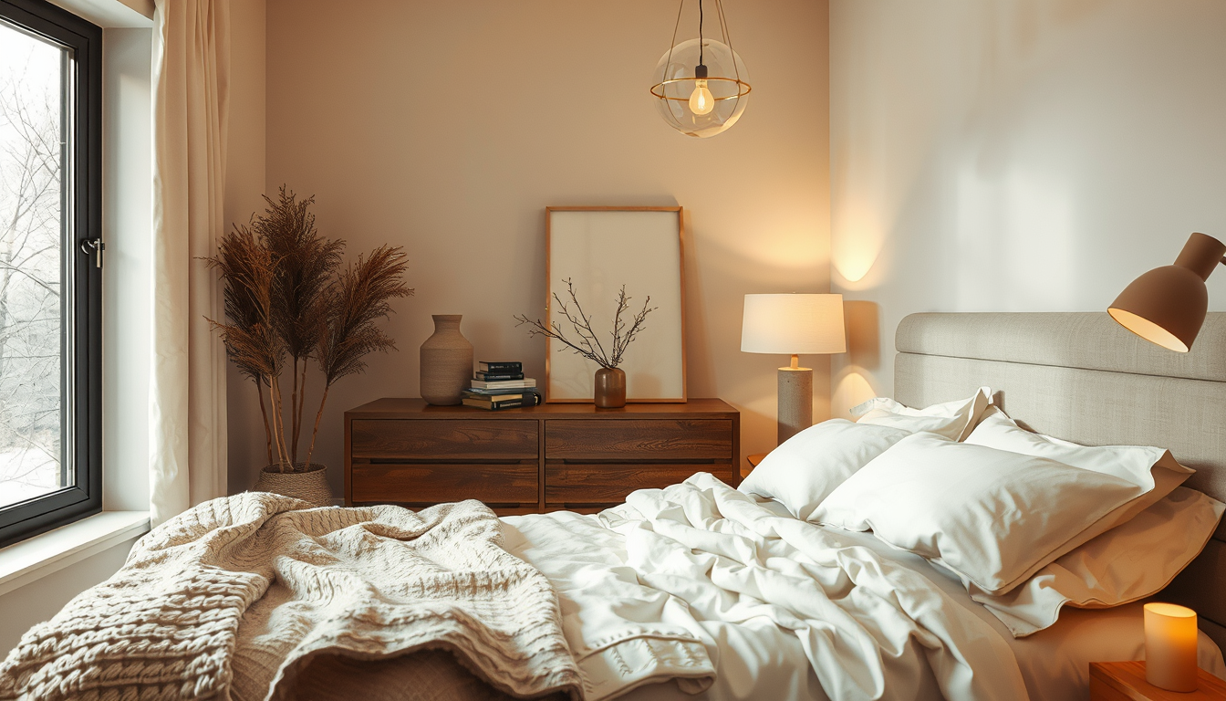
Build a Warm, Layered Bedroom
Prioritize bedding, bedside lighting, and storage pieces that make small bedrooms feel softer and more restful.
Toronto Interior Designer may earn a commission if you shop through these links at no extra cost to you.
Not every trending colour belongs in your bedroom. Here are seven that balance current design direction with sleep performance, all available through Canadian retailers.
| Colour | Brand & Code | LRV | Best Bedroom Orientation | Why It Works |
|---|---|---|---|---|
| Quiet Moments | Benjamin Moore 1563 | 61 | North or east | Blue-green that reads calm without going cold in low winter light |
| Silver Chain | Benjamin Moore 1472 | 65 | Any | Warm greige that adapts to shifting seasonal light; top staging pick |
| Pale Oak | Benjamin Moore OC-20 | 70 | North-facing | Warm neutral with enough depth to avoid looking washed out |
| Evergreen Fog | Sherwin-Williams SW 9130 | 30 | South or west | Muted sage that pairs with the neo-deco trend without overstimulating |
| Willow Tree | Para Paints P5253-34 | 45 | East-facing | Soft green with grey undertone; made in Brampton, ON |
| Skimming Stone | Farrow & Ball No. 241 | 66 | West-facing | Warm putty tone that handles golden-hour light beautifully |
| Borrowed Light | Farrow & Ball No. 235 | 72 | North-facing | Airy pale blue that maximizes scarce winter daylight |
Para Paints deserves a specific mention — it is the only major paint brand manufactured entirely in Canada, with its plant in Brampton, Ontario. Their colour development accounts for Canadian interior lighting standards, which is a practical advantage competitors rarely discuss.
“The biggest mistake I see in Toronto bedrooms is choosing a colour under showroom lighting. Your north-facing Victorian and your south-facing condo tower are two completely different light environments — the same swatch will look like two different colours.” — Toronto Interior Designer editorial team
How Canadian Light and Seasons Change Your Bedroom Colour
This is the variable that no national design magazine addresses properly. Toronto receives approximately 2,066 sunshine hours per year, but winter months average only 3 to 4 hours of direct light daily . That means a colour you chose in July’s bright, warm light will behave completely differently by November — and you need to plan for both extremes.
The key metric to understand is LRV — Light Reflectance Value. It measures how much light a paint colour bounces back into the room on a scale of 0 (pure black) to 100 (pure white). For Canadian bedrooms, here is a practical framework:
- North-facing bedrooms receive cool, indirect light year-round. Choose colours with an LRV of 60 or higher and warm undertones to prevent the room from feeling sterile in winter.
- South-facing bedrooms get the most consistent natural light. You have more flexibility — LRV 40–65 works well, and you can handle deeper tones like muted sage or soft charcoal.
- East-facing bedrooms catch warm morning light and go cool by afternoon. Blue-greens and warm greys balance the shift without clashing at either end of the day.
- West-facing bedrooms get golden-hour warmth in the evening. Avoid warm yellows or oranges that will amplify to an uncomfortable intensity at sunset. Lean toward cool neutrals or soft putty tones.
- Basement bedrooms — common in Toronto’s semi-detached homes — need an LRV of 65 or above. Skip anything with strong blue or green undertones, which will read murky under artificial light.
This orientation logic also applies when selecting warm neutral paint colours for adjoining hallways and living areas that need to flow visually from the bedroom.
Warm vs. Cool Bedroom Tones: Matching Colour to Your Space
The 2026 design landscape presents a genuine tension. The neo-deco trend pushes rich, warm colours — deep greens, burgundy, warm metallics — while sleep science favours cool, desaturated palettes. The resolution is not picking one side. It is knowing where each belongs.
Use cool tones on the walls. Blues, blue-greens, and cool greys should dominate the largest surface area in your bedroom. They set the baseline for calm and support your circadian rhythm as evening light fades.
Use warm tones in accents. Burgundy throw pillows, warm brass hardware on your nightstand, a terracotta vase — these bring the neo-deco richness without overstimulating the space. The 60-30-10 rule works here: 60 percent cool wall colour, 30 percent warm textile or furniture tone, 10 percent metallic or deep accent.
For Canadian resale value, this balance also performs well. Soft blue-grey and warm greige consistently rank as top bedroom colours for staging, according to Canadian real estate staging guidelines . Buyers respond to bedrooms that feel restful and neutral without reading as cold or impersonal.
What to Do Next
Choosing a bedroom colour is a decision you will live with through at least two full Canadian seasons. Get it right by following these steps:
- Test with large swatches. Paint a 2-by-2-foot section on two different walls — one that gets direct light and one that does not. Observe it at 8 AM, 2 PM, and 10 PM before committing.
- Check the LRV. Ask for it at the paint counter or look it up on the brand’s website. Match it to your bedroom’s orientation using the framework above.
- Buy Canadian where you can. Para Paints and Benjamin Moore both have strong Canadian operations with colour lines developed for our light conditions.
- Sample in winter if possible. Toronto’s lowest-light months reveal how a colour truly performs. A summer-tested swatch may disappoint you by December.
- Think beyond walls. Ceiling colour, trim contrast, and textile temperature all interact with your wall paint. Explore our bedroom category for coordinating ideas.
The best bedroom colour ideas Canada homeowners can invest in are not the trendiest — they are the ones tuned to your light, your layout, and the way you actually sleep. Start with the science, filter through your orientation, and pick from proven palettes. Your sleep will thank you for it.
Shop Bedroom Essentials Without Guesswork
Use Canadian-friendly retailers with straightforward sizing and finish options before committing to larger pieces.
Toronto Interior Designer may earn a commission if you shop through these links at no extra cost to you.
Sources
- Travelodge Sleep Study — https://www.travelodge.co.uk
- Colour Research & Application Journal — https://onlinelibrary.wiley.com/journal/15206378
- Architectural Digest 2026 Trends — https://www.architecturaldigest.com
- Environment Canada Climate Data — https://climate.weather.gc.ca
- RE/MAX Canada — https://www.remax.ca
Frequently Asked Questions
What is the best bedroom paint colour for Canadian homes?
Soft blue-greens like Benjamin Moore Quiet Moments and warm greiges like Silver Chain consistently perform best in Canadian bedrooms. Choose colours with an LRV of 60 or higher for north-facing rooms and 40–65 for south-facing rooms to account for seasonal light shifts.
Does bedroom wall colour actually affect sleep quality?
Yes. Research shows that cool-toned hues such as soft blues and muted greens are associated with lower heart rate and reduced blood pressure, both of which support faster sleep onset. People sleeping in blue bedrooms averaged nearly 8 hours of rest compared to under 6 hours in purple rooms.
How do I choose bedroom paint colours for a north-facing room in Toronto?
North-facing bedrooms receive cool, indirect light year-round, so choose colours with an LRV of 60 or above and warm undertones. Pale Oak by Benjamin Moore or Borrowed Light by Farrow & Ball are strong picks that prevent the space from feeling cold or sterile in winter.