The toronto interiors warm neutral trend is no longer a whisper among local designers — it’s the dominant direction reshaping how we think about colour in Canadian homes. For years, the design world defaulted to crisp white walls as a safe, universally appealing backdrop. But Toronto’s northern light, condo-heavy housing stock, and deeply multicultural design community have exposed a truth the rest of the industry is only now accepting: all-white was never the right answer for this city. The warm neutrals replacing it — mushroom, camel, ochre, warm clay, and limewash plaster tones — aren’t just on-trend. They solve real problems that Toronto homeowners face every single day.
Why All-White Interiors Fail in Toronto’s Northern Light
Walk into a north-facing Toronto condo between November and March, and you’ll see the problem immediately. Cool whites go flat. They turn grey. They make a 550-square-foot space feel like a waiting room rather than a home.
Toronto receives an average of roughly 2,066 sunshine hours per year — significantly fewer than US design capitals like Los Angeles or Miami . That low winter sun angle means cool-toned whites rarely get the bright, diffused daylight they need to look fresh. Instead, they absorb the bluish cast of overcast skies and fluorescent hallway spill from condo corridors.
Condos account for approximately 47% of Toronto’s occupied dwellings — the highest condo density in North America . Most of those units come with fixed window orientations and compact footprints where every colour decision is magnified. A warm white with yellow or pink undertones reads as inviting under low light; a stark cool white reads as institutional. Toronto designers figured this out long before the trend went mainstream.
“Our South Asian, Mediterranean, and East Asian design communities have worked in warm palettes for generations. The rest of the industry is finally catching up to what felt obvious here all along.”
Benjamin Moore’s 2026 Colour of the Year — a deep warm brown in the “Hickory Smoked” family — continues a three-year streak of earthy, grounded tones replacing the grey-white dominance of the last decade . Both Dulux/PPG and Sherwin-Williams shifted their 2025–2026 palettes toward “sun-baked” and “heritage” warm neutrals, confirming this isn’t a regional blip but an industry-wide correction .
The Warm Neutral Palette Toronto Designers Recommend in 2026
See the Pieces Behind the Trend
Translate trend ideas into real products by starting with lighting, occasional furniture, and layered decor.
Toronto Interior Designer may earn a commission if you shop through these links at no extra cost to you.
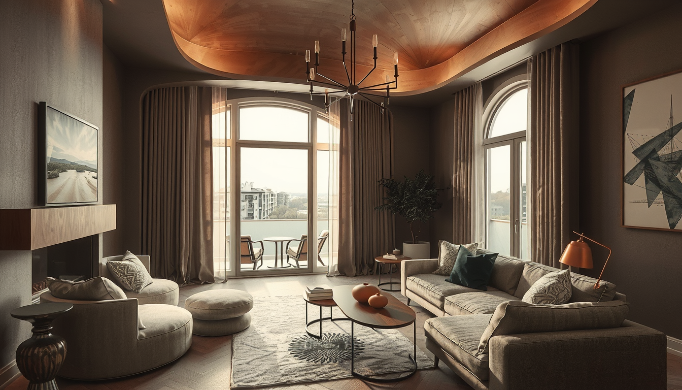
So what exactly is replacing all that white? The answer is layered, not monolithic. Toronto designers are building palettes around a core of warm neutrals that shift in depth depending on room size, light exposure, and function. Here’s how the most popular directions break down for Toronto homes:
| Trend | Why It Works in Toronto Homes | Budget Impact | Best Room |
|---|---|---|---|
| Limewash plaster finishes | Adds texture and depth to flat condo drywall; warm undertones counteract grey winter light | $$ — requires skilled application but no structural changes | Living room, dining room |
| Mushroom and greige tones | Reads warm under low northern light without veering too dark in compact spaces | $ — paint-only update with high visual impact | Bedroom, hallway |
| Terracotta and warm clay accents | Brings Mediterranean and South Asian warmth; pairs with Toronto’s multicultural design influences | $ to $$ — accent walls, tile, or textiles | Kitchen, bathroom |
| Camel and ochre soft furnishings | Adds warmth through layering without committing to wall colour; easy to swap seasonally | $ — cushions, throws, and upholstery | Any room |
| Warm wood millwork and panelling | Creates perceived depth in small condos; natural material warmth suits Canadian winters | $$$ — millwork investment but long-lasting | Home office, living room |
The key principle: these tones work together as a system. A mushroom wall, a camel sofa, and a terracotta throw pillow create a room that feels collected and warm — not themed or matchy. Toronto Interior Designer contributors consistently recommend starting with one warm-toned wall colour, then building outward with textiles and natural materials rather than committing to a single shade everywhere.
How Toronto’s Northern Light Changes Warm Neutral Colour Selection
Light is the single biggest variable that separates Toronto colour decisions from those made in sun-drenched markets. Understanding it is the difference between a room that feels intentionally warm and one that just looks muddy.
Toronto’s winter sun sits low on the southern horizon, casting long amber light through south-facing windows and leaving north-facing rooms in cool, diffused shadow. A single paint colour can read completely differently depending on which wall of your condo it’s on. Warm neutrals with yellow, peach, or pink undertones compensate for that cool northern exposure. On south-facing walls, those same tones glow beautifully without the harsh bleach-out that bright whites suffer at midday.
Google Trends data shows Canadian searches for “warm white paint” and “warm neutral interiors” have climbed roughly 80% since 2023, while searches for “all-white interior” have declined . That search behaviour maps directly to homeowners experiencing the gap between how white interiors look in magazine photography — shot under professional lighting — and how they look in a real Toronto living room on a Tuesday in February.
If you’re choosing colours for a bedroom, test your paint samples on the darkest wall at 4 p.m. in winter. That’s the moment of truth. If the swatch still reads warm and inviting under those conditions, you’ve found your colour.
5 Proven Ways to Make Warm Neutrals Timeless in Toronto Homes
Every colour trend risks becoming dated. Warm neutrals have a structural advantage — they connect to natural materials and human skin tones in ways that feel instinctively right — but execution matters. Here’s how Toronto Interior Designer experts recommend future-proofing the approach:
1. Layer texture, not just colour. A flat warm beige wall is just as boring as a flat white one. Limewash, plaster finishes, and warm wood panelling add dimension that keeps a room interesting as trends evolve. The 2025 IDS Toronto (Interior Design Show) featured a notable shift toward exhibitors showcasing these textured finishes over the flat painted surfaces of previous years .
2. Anchor with permanent neutrals, accent with trend-forward tones. Paint your walls in a mid-range warm neutral — mushroom, warm greige, or soft clay — and bring bolder expressions like terracotta or ochre in through textiles, art, and accessories. When the trend cycle shifts, you swap cushions, not contractors.
3. Respect the architecture. In pre-war Toronto homes with crown moulding and hardwood, warm neutrals enhance what’s already there. In modern condos with clean lines, they add the character the architecture doesn’t provide. Either way, the warmth serves the space rather than fighting it.
4. Commit to one material story. Natural wood, warm metals like brass or unlacquered bronze, and organic textiles like linen and wool all reinforce the warm neutral direction. Mixing in chrome, high-gloss lacquer, or cool-toned marble creates a visual argument that makes neither side convincing. When renovating your kitchen, carry the same warm material logic through cabinetry, hardware, and countertop choices.
5. Match your lighting to your palette. Warm neutrals fall apart under cool-white LEDs. Replace any bulbs rated above 3500K with warm options in the 2700K–3000K range, and consider dimmable fixtures that let you dial warmth up as daylight fades. The right lighting is the cheapest way to make your colour choices look intentional year-round.
What to Do Next
The toronto interiors warm neutral trend isn’t a passing fad — it’s a correction toward colours that actually work in our climate, our housing stock, and our cultural context. Toronto designers have been building in this direction for years, and the global industry has finally arrived at the same conclusion.
Here’s how to start the transition without a full renovation:
- Test before you commit. Buy three warm neutral paint samples and tape them to your darkest wall. Live with them through a full day-night cycle before deciding.
- Start with one room. A bedroom or living room is the lowest-risk place to introduce warm tones. See how it feels before expanding.
- Swap textiles first. New throw pillows, a warm-toned area rug, and linen curtains can shift a room’s entire temperature for under $500.
- Upgrade your lighting. Replace cool-white LED bulbs (4000K+) with warm options (2700K–3000K) to support the palette.
- Visit the Toronto Trends section for ongoing coverage of what’s working in local spaces right now.
- Consult a local designer. Toronto-specific light conditions and condo layouts benefit from professional colour consultation — it’s one of the highest-ROI investments you can make before picking up a brush.
Keep the Trend Livable
Ground any trend with simple, versatile pieces that still work when the room evolves over the next few years.
Toronto Interior Designer may earn a commission if you shop through these links at no extra cost to you.
Sources
- Environment Canada climate data — https://climate.weather.gc.ca
- Statistics Canada Census — https://www.statcan.gc.ca
- Benjamin Moore colour trends — https://www.benjaminmoore.com
- Sherwin-Williams colour forecast — https://www.sherwin-williams.com
- Google Trends — https://trends.google.com
- IDS Toronto — https://www.interiordesignshow.com
Frequently Asked Questions
Why are Toronto designers moving away from all-white interiors?
Toronto’s low winter sun and north-facing condo units make cool whites appear grey and institutional. Warm neutrals like mushroom, camel, and clay tones compensate for the city’s limited sunshine hours and create inviting spaces year-round.
What are the best warm neutral paint colours for Toronto condos?
Toronto designers recommend mushroom, warm greige, and soft clay tones for walls, with terracotta and ochre as accents. Test samples on your darkest wall at 4 p.m. in winter to see how they perform under real Toronto light conditions.
How can I add warm neutrals to my Toronto home on a budget?
Start by swapping textiles like throw pillows, area rugs, and linen curtains in camel or ochre tones. Replace cool-white LED bulbs with 2700K–3000K warm options. A single accent wall in a warm neutral paint is a low-cost, high-impact update.